Expanding an Existing Brand System
Brand Guide
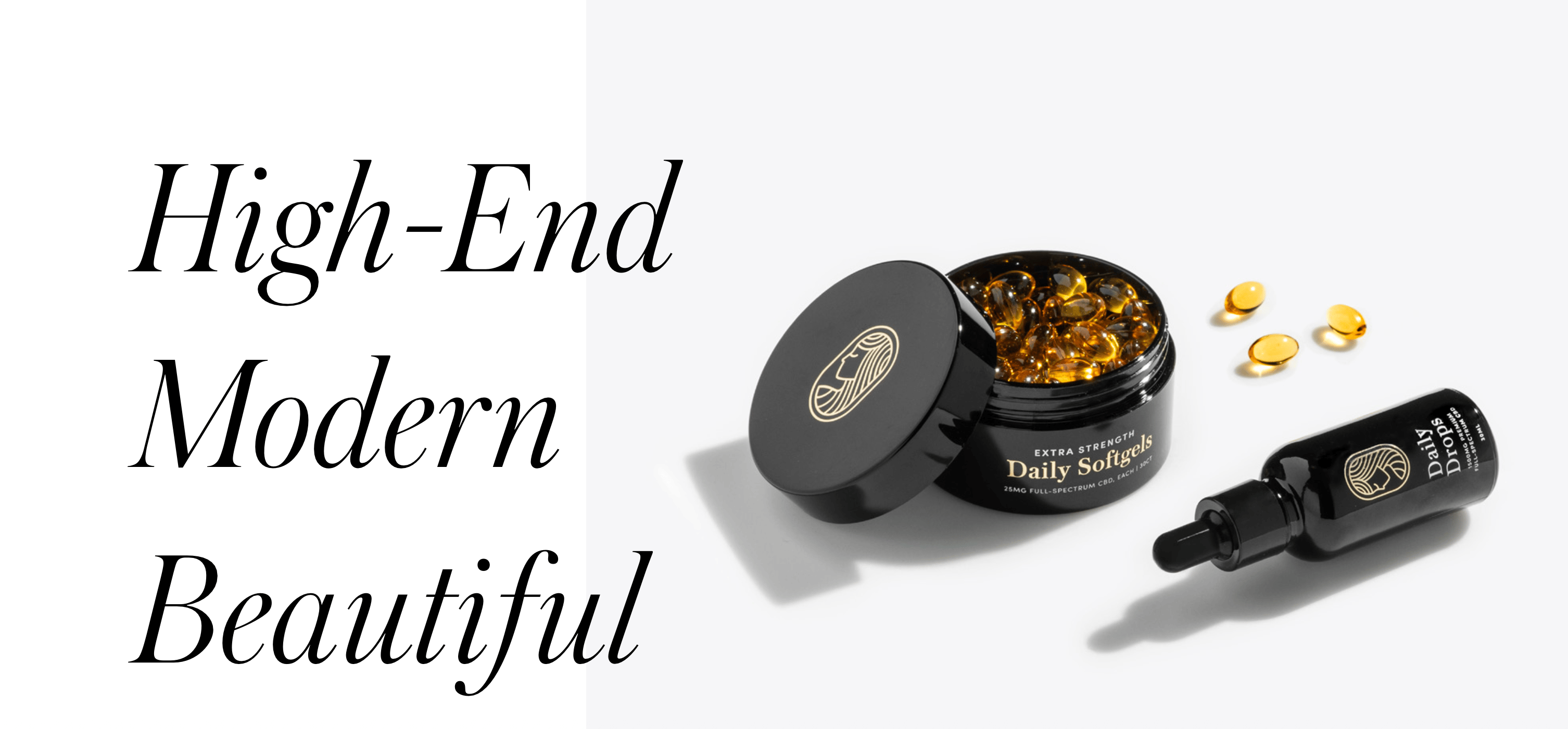
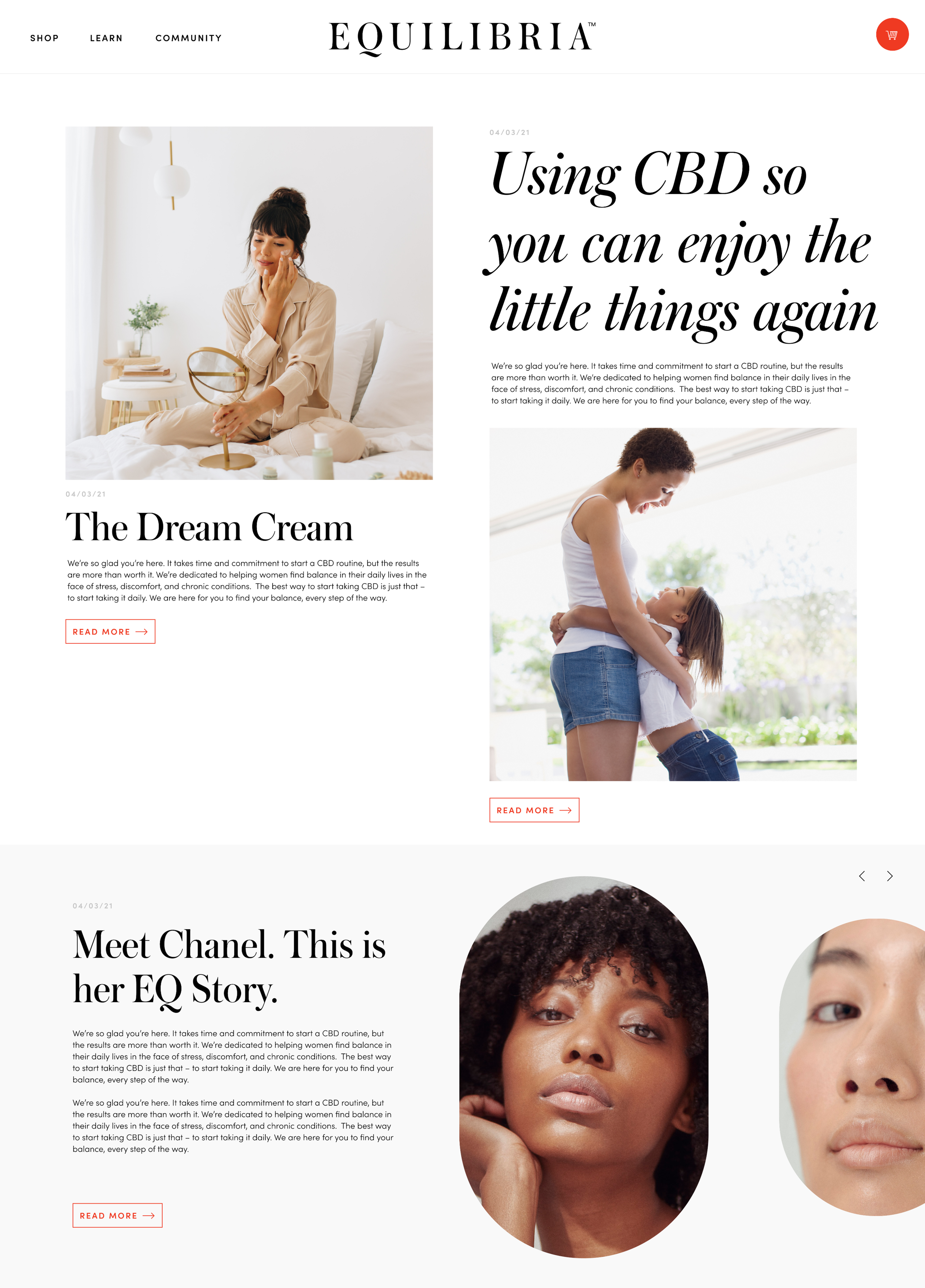
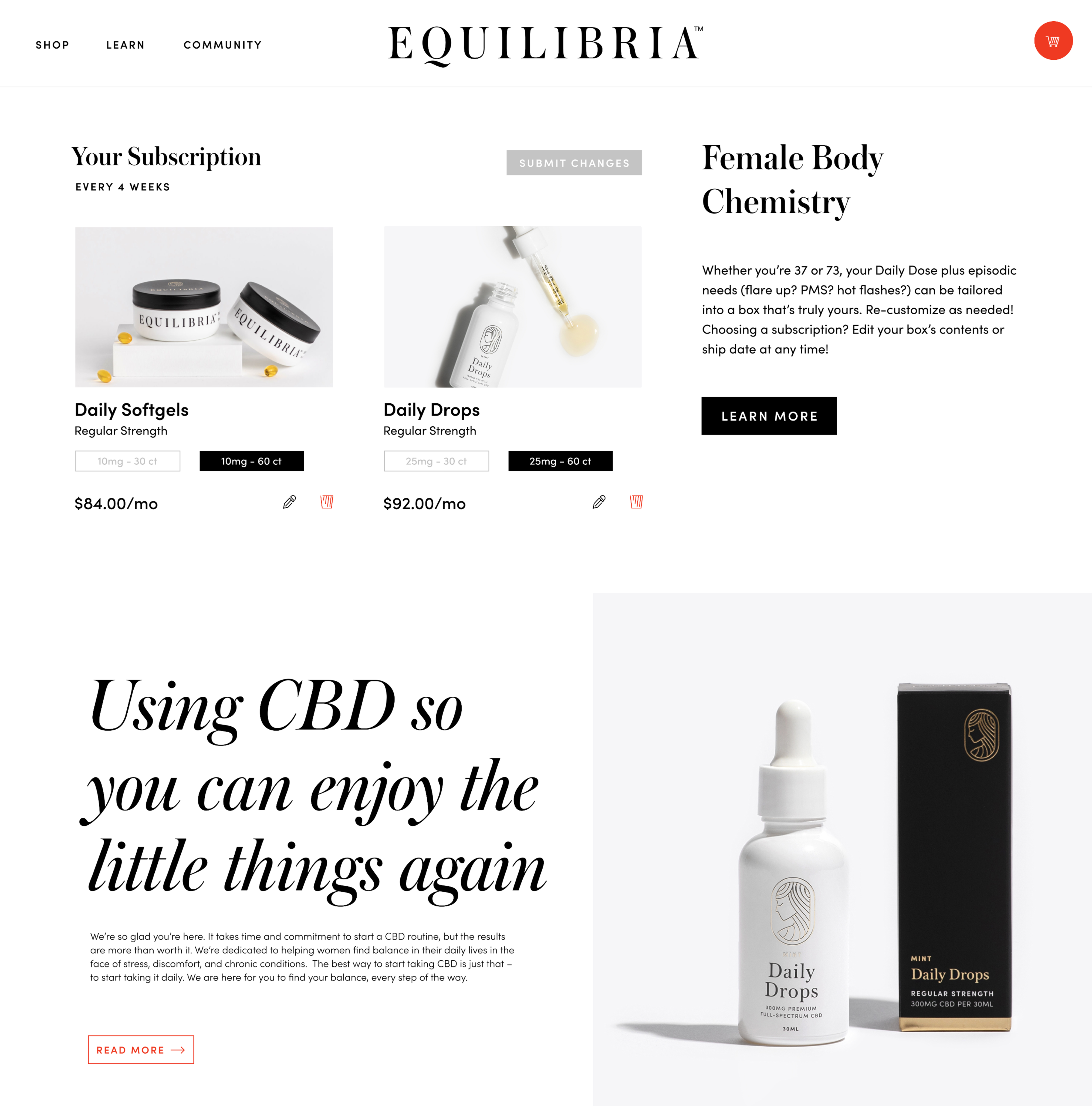
Equilibria Site
Equilibria Brand Expansion
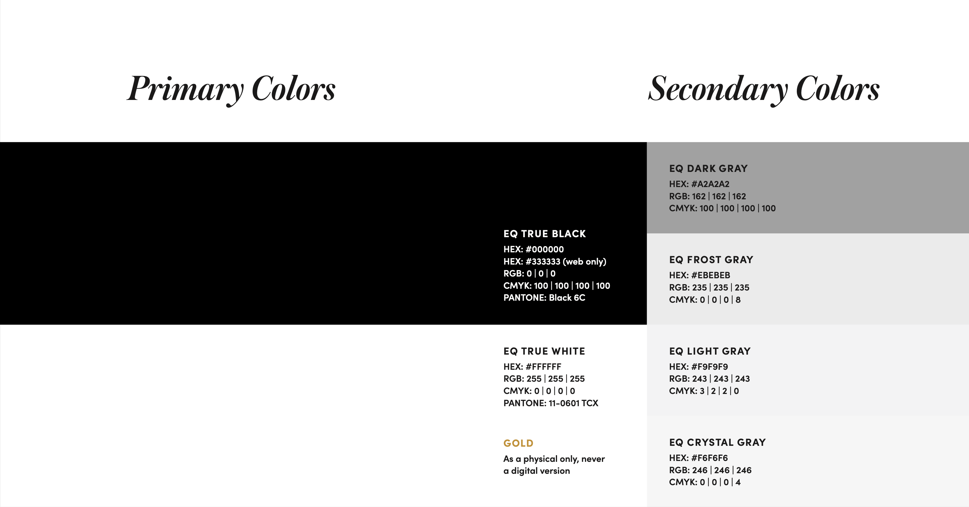
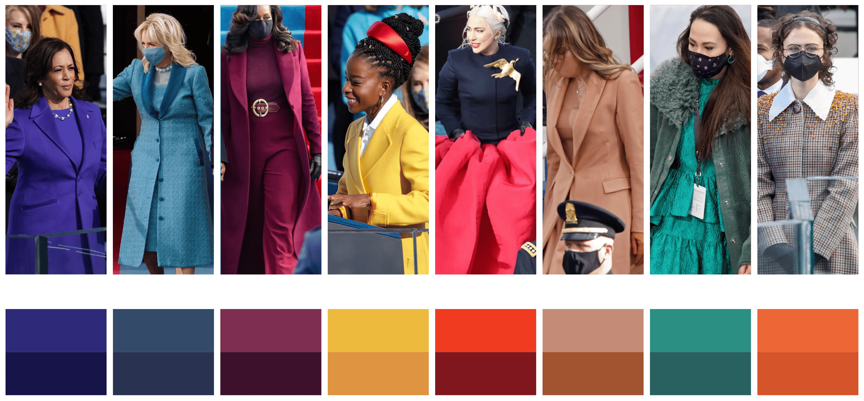
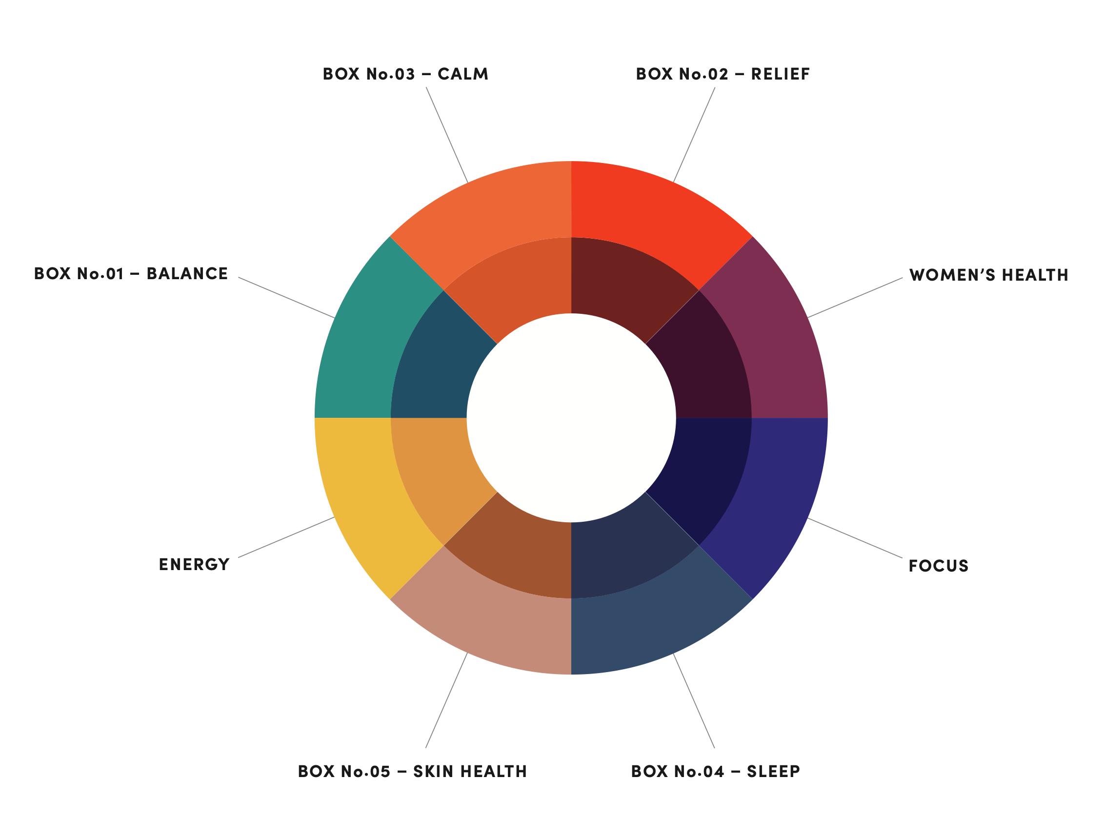
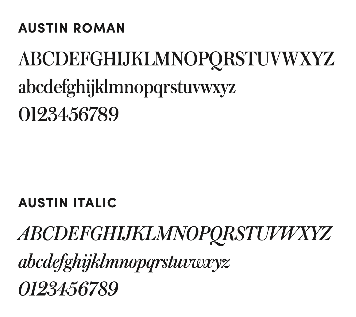
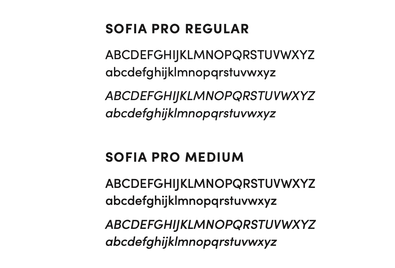
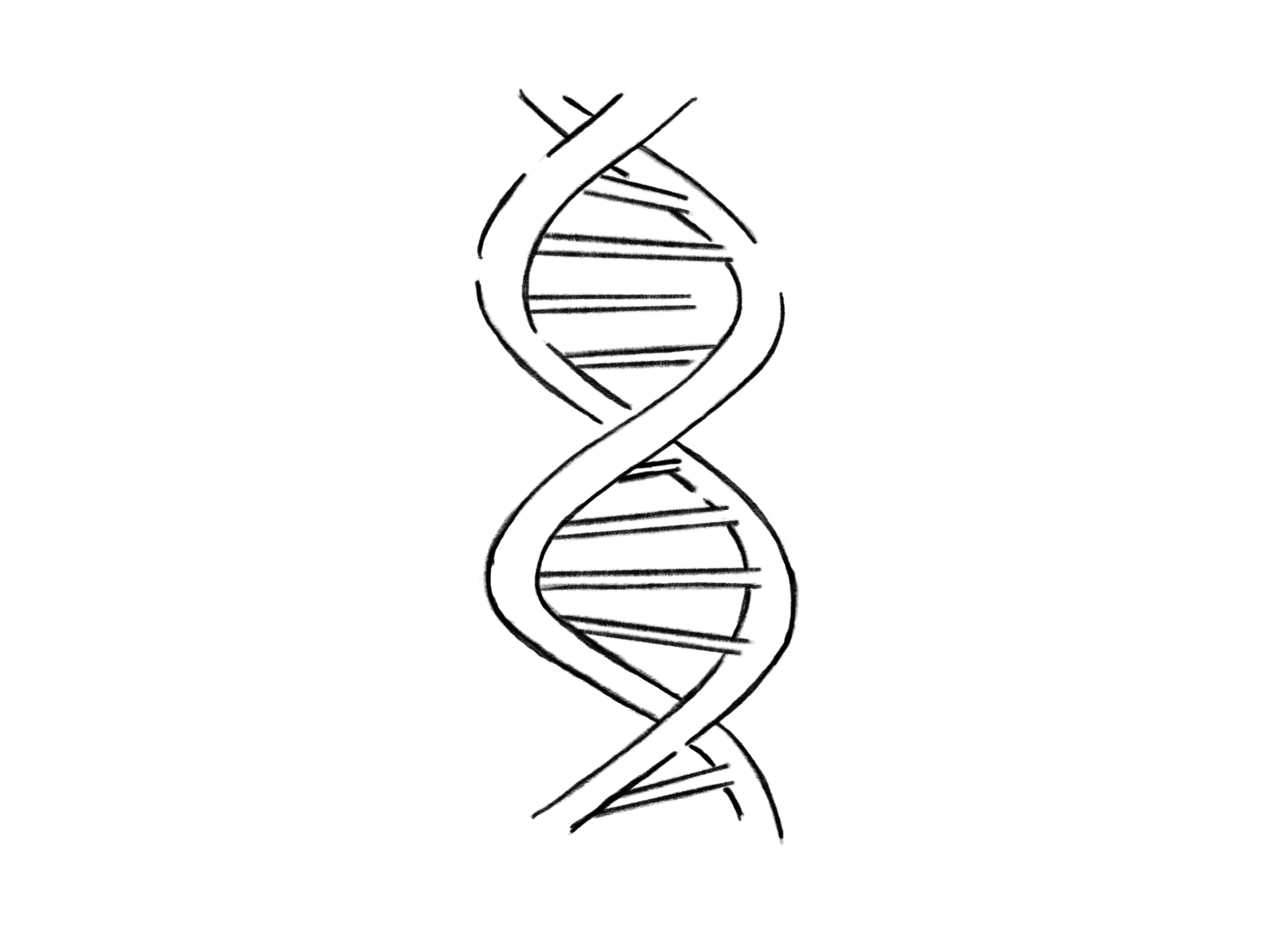
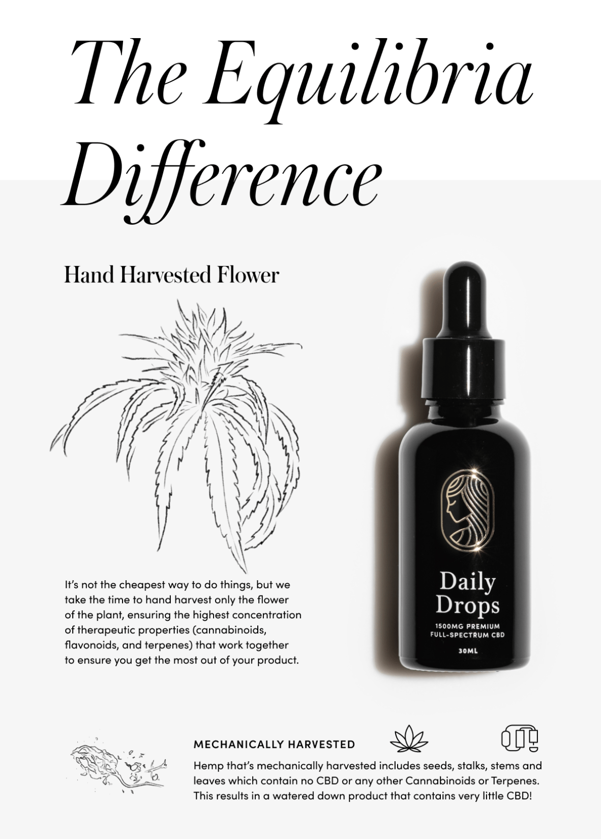
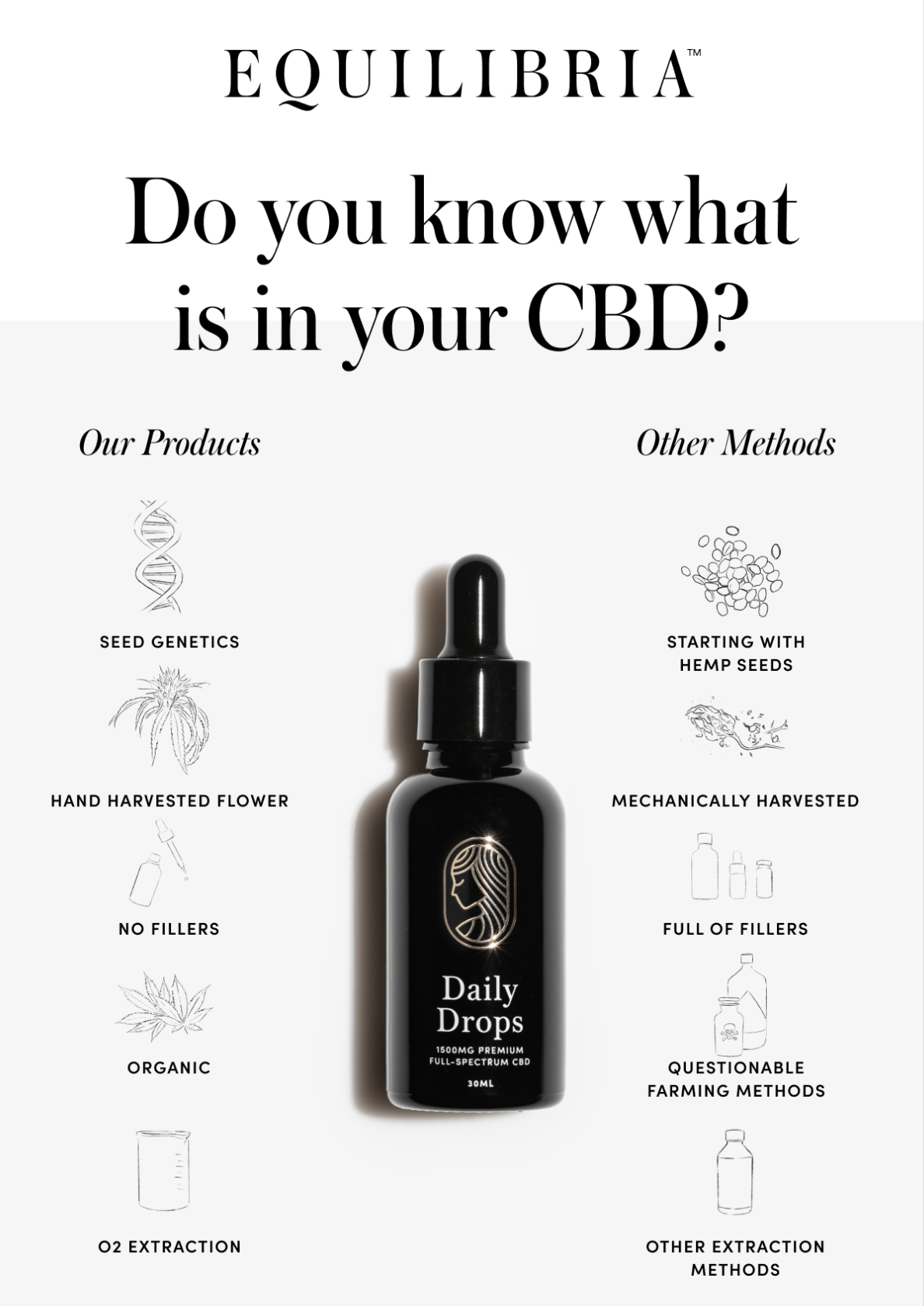
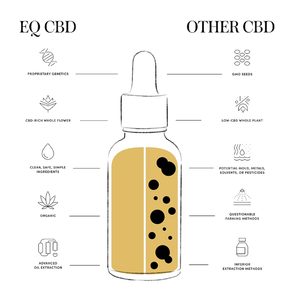
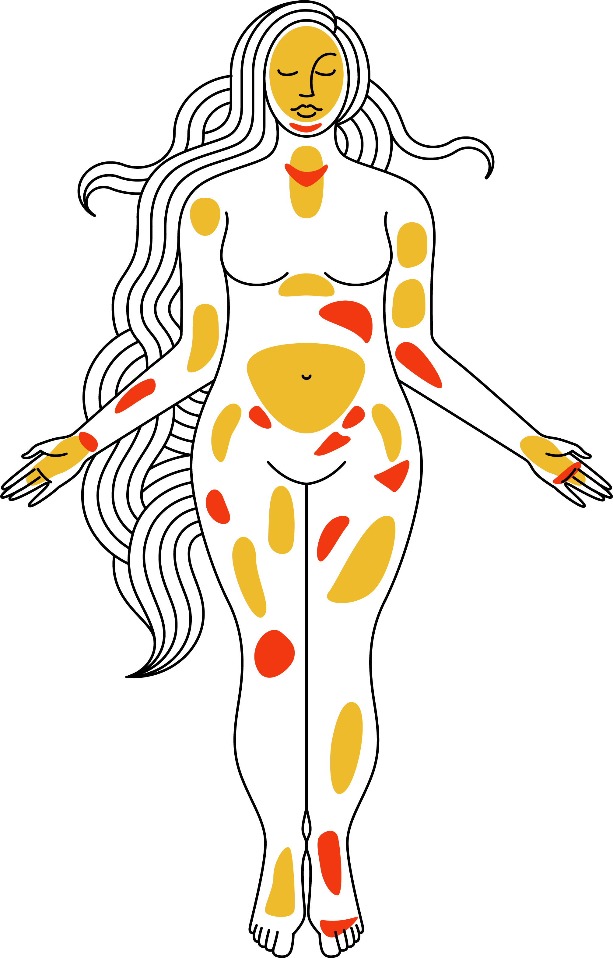
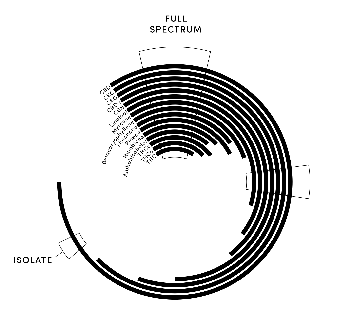
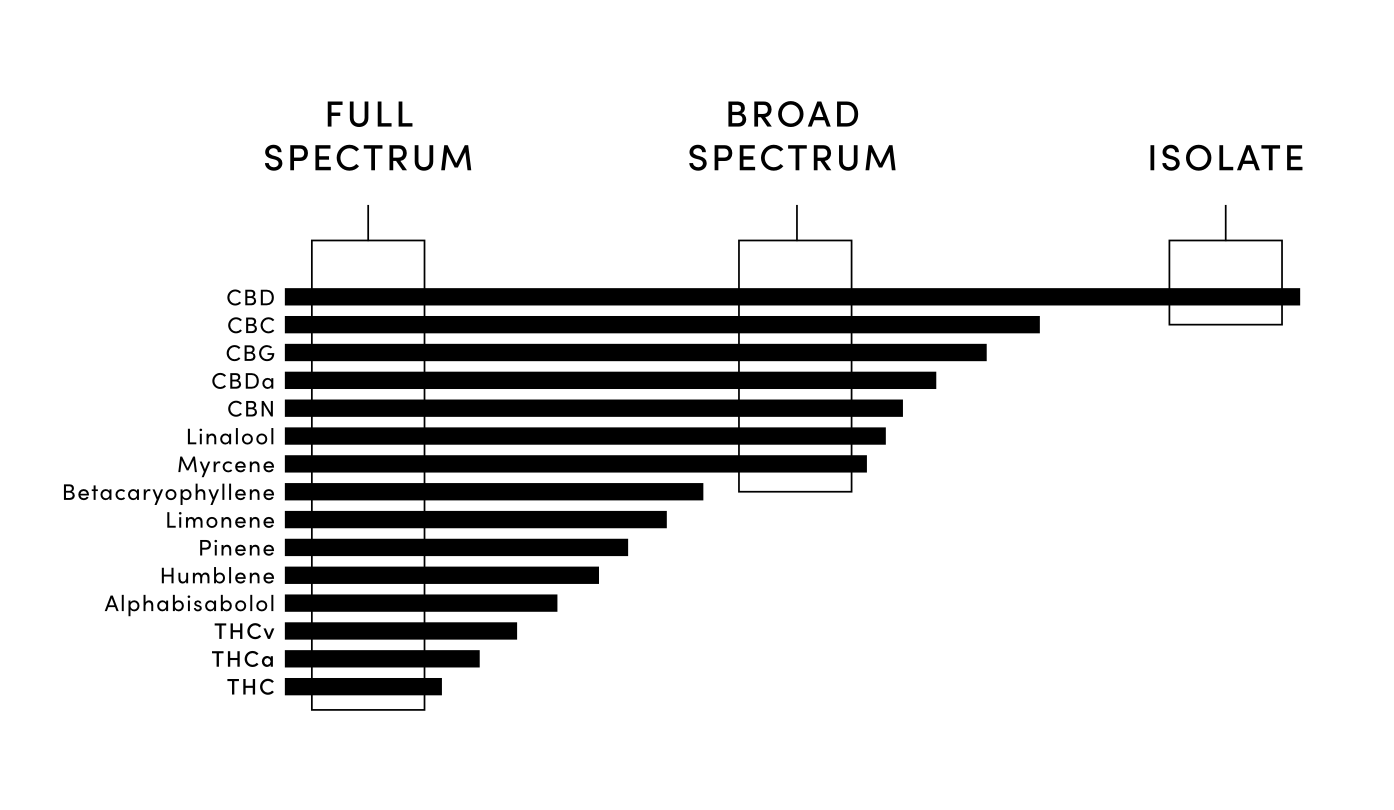
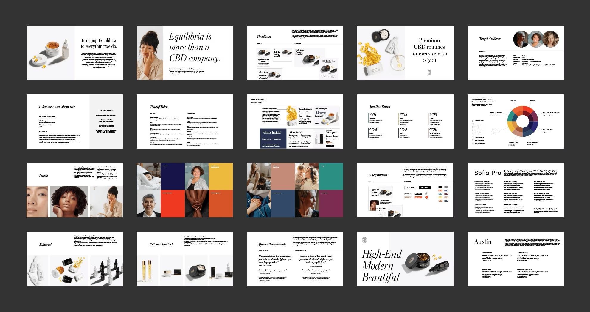
I had the honor of working with the Equilibria creative team to fine-tune their brand standards. Equilibria is an all female company, owned and operated, that seeks to support women’s health for all ages. They have a logotype, logo mark and typeface that serves them well, but they hired me to expand on the brand identity and define the correct use of the design elements to best serve them. I explored a broader color scheme, developed iconography, various infographics, and a new illustration style.
Scope
Brand Development
Illustration
Iconography
Infographic Design
Teams Involved
Equilibria Brand Team
Social Media Team
Marketing Team